Over the summer of 2020, I created a Kickstarter campaign to create an affordable online video course on typeface design. It received an overwhelming amount of support and funding from the community.
For the supporter tier of the campaign, the backers chose words that they wanted to be flourished on a card. It was a lot of fun to go through their word choices, since there were lots of names of loved ones, favorite quotes, or causes they believed in. They often made me happy, touched, and even made me laugh. Since I had to let them all go to their new homes after a few weeks, I made a little page to house memories of them.
Client: Kickstarter Patrons
Note: To protect privacy, any cards with identifiable names have been omitted from the public gallery.
Based on the popular Trade Gothic family, I designed two multi-layer display styles for Monotype. After experimenting with what styles could be most interesting, I settled on two multi-layer design styles that could look 3-dimensional.
The first style was Trade Gothic Display 1, an embossed weight with highlights. The highlights are designed to swell and wane, maximizing the illusion of the raised surface.
The second style is Trade Gothic Display 2, which mimics a sharply incised bevel. This style has a shadow layer and an outline layer so users can pick their own combinations.
Both of the styles have a solid base layer, which all the decorative layers build on. The base layer was designed to be as faithful as possible to Trade Gothic Condensed Heavy, originally designed by Jackson Burke and later modernized by Akira Kobayashi. Some modifications, such as lowering the thick and thin contrast, were inevitable, but all weights are unmistakably Trade Gothic.
Client: Monotype
Type Director: Steve Matteson
Available for purchase through MyFonts
Trade Gothic Inline is a companion to Trade Gothic Display, but meant to be more practical in its application. If Trade Gothic Display is meant to be an eye-catcher, the inline family is meant to be more versatile. The main challenge of this family was to retain the overall density and appearance of the original Trade Gothic family. The width of the inlines decrease as the weight increases, giving the typeface more density as it gets heavier.
Client: Monotype
Type Director: Steve Matteson
Available for purchase through MyFonts
This was drawn for the ‘Poetic Computation: 7 Years of SFPC’ exhibition.
I was very excited when I was asked to draw the poster, since my experience at SFPC was a life-shaping one. In 2018 I attended Code Societies and the fall immersive program, and it radically changed the way I interact with technology and community. It also gave me the confidence and insight to pursue technically challenging projects.
Drawn with Procreate on iPad Pro.
You can buy Ampersandist on Future Fonts!
This work-in-progress typeface started as a logotype for a project called Ampersandist. In addition to the logotype, I created various ampersands to be incorporated into the visual branding. These letter forms are inspired by Oldřich Menhart and Villu Toots. I started by writing the letters with a broad edge nib. Then I drew sketches based on my writing and vectorized it in Robofont.
This is the first typeface I have explored making with an intimate knowledge of calligraphy. Bridging my calligraphy with my typeface design has been an interesting process. In order for the typeface to work as a system, I have had to make adjustments and tweaks that were not in the original calligraphy or logotype sketches and figure out how to make something that looks and feels calligraphic even if a calligraphy tool alone could not have made the shapes.
The classic English pangram was made into a poster for ‘Found In Translation’, an exhibit in New York featuring Latin and Korean typographic posters.
Client: Stigma & Cognition
One of the most recent areas of exploration I have been focusing on is creating interactive 3-dimensional typography using programming. Being able to create typography in a 3D space is super exciting since having a perspective to gauge depth makes a huge difference from a flat 2 dimensional space. It allows for another level of expression, including the idea of time and physicality.
Advisor: Zach Lieberman
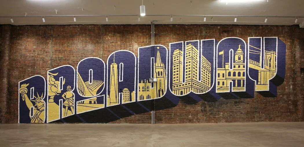
Mural painted on the 2nd floor of 120 Broadway in New York City. Each letter contains an iconic scene or building that can be seen from the iconic Broadway street.
Client: Silverstein Properties
Art Direction: Dara McQuillan
Videographer: Kevin Yeh
For the site of 2 World Trade Center, I was commissioned to paint a 16ft by 21ft mural inspired by retro ‘Greetings From’ postcards. Over the course of a week, I hand-painted a lettering piece on the exterior of the building.
Client: World Trade Center, Core12
Art Direction: Anthony Elder
I was commissioned by Kiplinger’s Personal Finance Magazine to create lettering illustration for the feature article, ‘50 Quick & Easy Money Tips’.
Client: Kiplinger’s Personal Finance Magazine
Art Director: Stacie Harrison
Language has been around since human beings learned to communicate with one another. The power of communication is vast — it has the seismic power to inspire and create cultural moments. Could typographic communication be brought into the physical realm, and how could it interact with its surroundings? This is a prototype that I created while thinking about this question.
As part of my studies at the School for Poetic Computation, I created a device that could simulate this interaction using wooden cams, acrylic rods, plywood, 2812b LED strips, and openFrameworks. The motors and cams acted as devices that were making physical waves, and the mounted rods on top served as individual movable screens with individually addressable LEDs.
Advisor: CW&T, Zach Lieberman from the School for Poetic Computation
I was commissioned to create artwork inspired by classic ‘Greetings From’ postcards to decorate the parameters of the World Trade Center construction site.
Client: World Trade Center, Core12
Art Direction: Anthony Elder
I hand-lettered and designed packaging and identity for a line of four flavors of Hany's Fire Tonic, a raw apple cider vinegar infusion tonic. The lettering and design are intended to convey the bold, invigorating taste of the tonic.
Client: Hany’s Harvest
In 2013 and 2014 I drove across the United States twice (from New York to California and back). To commemorate the experience, I designed and hand painted a map of the United States. The lettering was inspired by various American wood types from the 19th century.
I created this festive blackletter-italic hybrid lettering style. The final card was cut out of white paper, then placed in a red fold-out envelope.
Constant (working name) is a bold and lively display typeface designed to have a playful nature as well as an assertive attitude in large scale.
It was inspired by a specimen from Constantin in 1834, but has since been redrawn to have a more refined, modern atmosphere. Taking cues from the playful friendliness of the French source material, but still also giving a tip of the hat to Bodoni, it is meant to be a wilder, playful younger brother of sorts. It is meant to be used in large applications, such mastheads and large-scale environmental design, where it can catch the eye for its assertive but playful nature.
Taking inspiration from the German tradition of paper cut-outs, this piece was written in Textura, carefully cut out from black paper, then attached to a green handmade paper to serve as the background.
For blackletter paper-cutouts, my greatest inspirations are Rudolph Koch, Rudo Spemann, Hermann Zapf, and Julian Waters.
This piece currently lives in the collection of Jerry Kelly and was included in The Calligraphy Revival: 1906 to 2016 exhibition at The Grolier Club.
These murals and window wraps were designed for PNC Wealth Management, a sponsor of the Pittsburgh Penguins hockey team, to celebrate the Penguins' fourth Stanley Cup win. I designed the display numerals to would represent the fierce spirit of these iconic hockey players, and interwove them within the lockup.
Client: PNC Wealth Management
Design Director: Craig Ward
Assistant Design Director: Brian Gartside
Art Director: Nicole Narvaez
Copywriter: Matthew Coleman
This neon sign was an experiment to see how flourishing could work with neon as the medium. It was made during an 8-week neon sign making and tubebending class at Brooklyn Glass.
Typefight is an online boxing ring where designers and illustrators alike battle with their best shots at creating letters. For my round, I was assigned a W.
For its boldness and pleasing curves, I decided to create a fraktur W. Based on its curves, I started creating delicate flourishes to compliment the boldness of the letter. As a final touch, botanical elements were added to soften the blackletter.
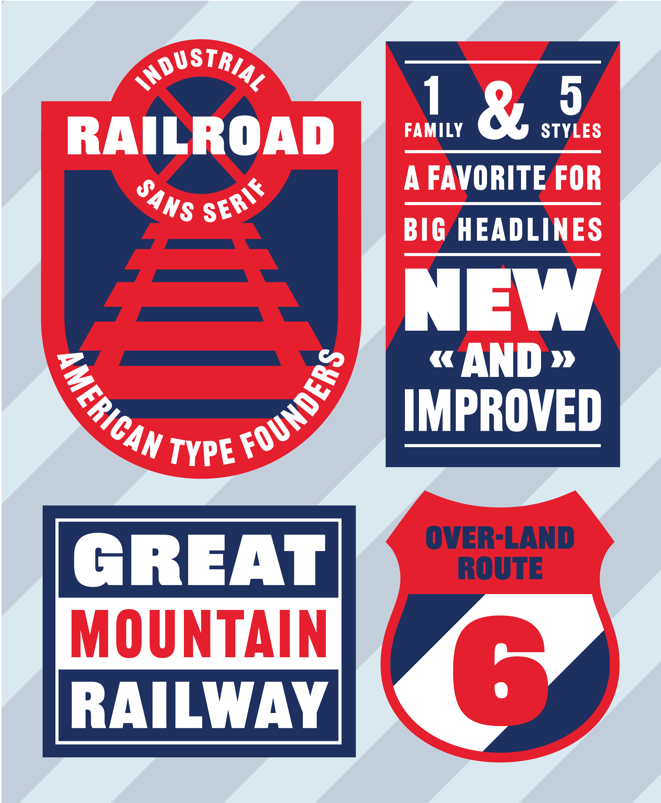
I designed the hero image for the ATF Railroad Gothic typeface family for Fonts.com. Inspired by the turn-of-the-century industrial spirit, this hero image is an homage to the ephemera of the era. The color palette is minimal to highlight the boldness of the typeface, and the copy utilizes descriptions of the typeface to emphasize its characteristics.
ATF Railroad Gothic family by American Type Founders Collection
Krylon is the sponsor of the World’s Longest Yard Sale or, as it is more commonly called, the 127 Yard Sale. For this 690–mile long yard sale, Deutsch had the idea to revitalize 127 old items into new through spray paint. Doubling as their transportation method and base of operations, the design crew made an extraordinary van for all the action.
This project has the honor of winning the Type Directors Club 62 and One Show Merit award.
Client: Krylon
Chief Creative Officer: Kerry Keenan
Executive Creative Director: Menno Kluin
Associate Creative Directors: Sam Shepherd, Frank Cartagena
Design Director: Juan Carlos Pagan
Associate Design Director: Brian Gartside
Designer: Lynne Yun, Joe Haddad
Copywriter: Lauren Cooper
Art Director: Erika Kohnen
Photographer: Catalina Kulczar-Marin
My team at Deutsch was asked to create insights about how a potential rebranding of the US Open could help to reach a newer, younger crowd. I designed an edgy logotype that could be used with photography to create a bold and fierce look that portrays the passion of tennis players.
Design Director: Craig Ward
Assistant Design Director: Brian Gartside
At Deutsch NY, I had the great opportunity of collaborating with extremely talented creatives to design the holiday promotional material. With an unusual concept of a blackletter holiday ornament in mind, each snowflake was drawn with a broad nib calligraphy pen. The greatest challenge was getting the hexagonal points to line up organically. The end product was a laser-cut white acrylic snowflake in a custom wooden box, as well as a website.
Client: Deutsch NY
Design Director: Juan Carlos Pagan
Senior Designer: Brian Gartside
For more than 30 years, PNC has calculated the Christmas Price Index, prices of the twelve gifts from the classic carol "The Twelve Day of Christmas."
For this year, Deutsch decided to create a Gingerbread Branch to celebrate this annual tradition. A life–size gingerbread bank branch was constructed, complete with 12 columns, ATM, candy vault, and teller windows. I had the great opportunity to design the overall branch architecture and details as well as the visuals that accompany the infographics and website.
The Branch was in development for around six months, including the design process, material prototyping and planning. The majority of baking and construction, however, took less than a month. Built through a collaboration of architects, fabrication designers and bakers, the gingerbread bakery stands 12 ft. tall and 20 x 17ft. wide. It was an immense group effort that took about 5,000 pounds (2.5 tons) of real gingerbread.
Client: PNC Financial Services Group
Chief Creative Officer: Kerry Keenan
Group Creative Director: Jeremy Bernstein
Senior Art Director: Alex Avis
Senior Copywriter: Justin Lee
Interactive Design Director: Aliza Adam
Design Director: Juan Carlos Pagan
Designer, Illustrator: Lynne Yun
Fabrication: Design Compendium
Bakery: Bredenbeck's
Photographer: Jeremiah Wilson
Created for the Society of Scribe's annual exhibition, "A Linear Language", this piece is a mandala made of flourishes. Using white and copper ink, it symbolizes the holiday festivities.
This was a fun project with Brooklyn Slate Co., where we polished up weathered, vintage cheese box ephemera to create a charming tote bag.
Client: Brooklyn Slate Co.
Art Direction: Sean Tice
Lettering & Illustration: Lynne Yun
René Redzepi is a star chef and co-owner of the famous restaurant Noma in Copenhagen, Denmark. This poster was made for the event Library Presents, in Apple Headquarters, where he came to talk about his methodology in creating dishes. The poster was inspired by his speciality in fish dishes and his signature style of utilizing cooking ingredients that were foraged from the earth and forest. All the greenery was photographed in a fish shape after being collected from the gardens around Apple Headquarters.
Art Director: Aled Williams
A hand lettered piece for a 4x6 postcard that celebrates the festivity at Disneyland, where it is called 'The Happiest Place on Earth'. Painted with gouache.
This is bookplate made from cut paper. The lettering style was inspired by the earthy, chunky styles of Oldřich Menhart and the free-flowing lines of Villu Toots.
“Ex Libris” is constructed out of three layers of paper held together with stitches on the side. My initial design explorations for “Ex Libris” were written with a broad-edged calligraphy pen, and I used that as the foundation for the pencil sketches that I later cut out of black paper. All of the letterforms are touching each other so the entire design can be cut out of single pieces of paper.
I designed and made this during a class with Carl Rohrs at the 2016 International Calligraphy Conference.
This past holiday season, North Street Creative had a great idea of creating an interactive holiday card. Keeping their black and white brand visuals in mind, a snowman with festive lettering was created for the front panel of their holiday card.
Client: North Street Creative
Creative Direction: Tom Conlon
Art Direction: Sean Tice, Bruce Viemeister
Lettering & Illustration: Lynne Yun
Part of a series of postcards of locations I've visited throughout the years, the Governors Island postcard has a vintage carousel theme, reflecting the collection of old french carousels that were located on the island.
For Book Expo of America, I was approached by London Review of Books to letter the subject of their most popular blog post to date: Lorem Ipsum and its translation. On a 10 x 10 ft. wall of the Javitz Center, Lorem Ipsum and its English counterpart was brush lettered with gouache paint.
Client: London Review of Books
Original Blog piece: Nick Richardson
Translation: Jaspreet Singh Boparai
“Carpe Diem” is made out of three layers of cut paper. The first layer is white, the second is black, and the last layer is hand-marbled. My initial sketches were brush calligraphy, done with instruction and guidance from calligrapher Carl Rohrs.
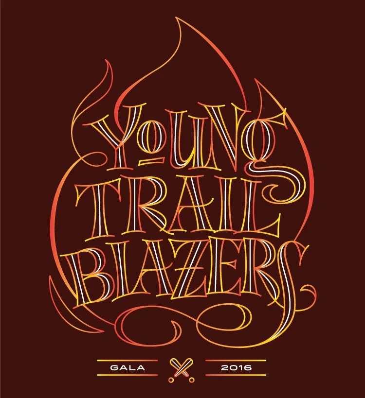
Live Out Loud is a non-profit organization in NYC that hosts an annual gala called Young Trailblazers, which is a fundraiser to support LGBTQ students. Originally drawn on paper then digitized, the intent behind the lockup is to express the passionate young LGBTQ leaders that are at the heart of this gala.
Client: Live Out Loud
Creative Director: Richard Kolopeaua
Associate Creative Director: Art Boonklan
Designer: Lynne Yun
Vercesi Hardware is a small mom-and-pop style hardware store that has a century long history. It changed its name to 23rd Street Hardware Store in recent years, but the owner is still the same. This identity was made in an effort to revive the old name and history of the store. The wood type was individually scanned in and set in the characteristics of early 1900s ephemera. The business card features a mini calendar on the back, which was a common practice in the era.
Part of a series of postcards of locations I've visited throughout the years, the lettering for San Francisco was particularly hard to decide on, since it was a place that I lived in for a year. In the end, I decided to reflect the variety of people and cultures that clash in the historic city - ending up in a colorful gradient with a variety of graphic styles.
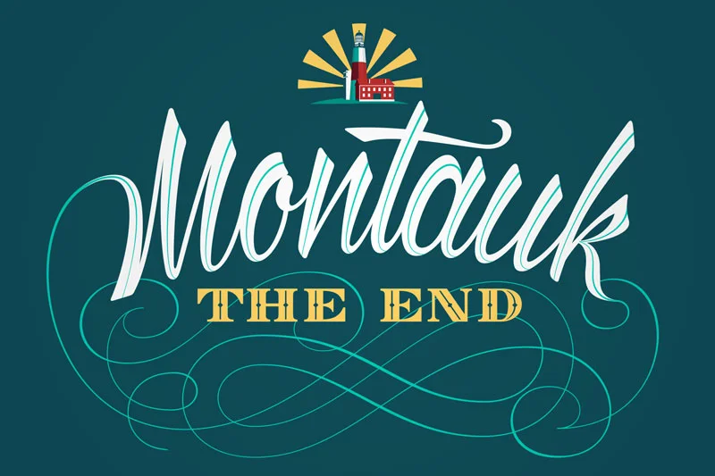
Part of a series of postcards of locations I've visited throughout the years, this lettering piece touches on the beachside romantic atmosphere of Montauk.
The Coney Island postcard is a part of a series of postcards that documents various locations around the U.S. Painted with gouache, this piece was hand lettered on cold watercolor paper.
A series of letterpress cards that were made for a self-promotional project. Each card represents a city that I had lived in up until that time. Hand-pressed with love in Brooklyn.