
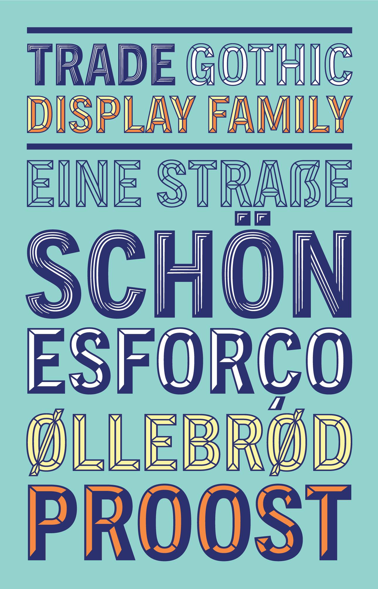
Based on the popular Trade Gothic family, I designed two multi-layer display styles for Monotype. After experimenting with what styles could be most interesting, I settled on two multi-layer design styles that could look 3-dimensional.
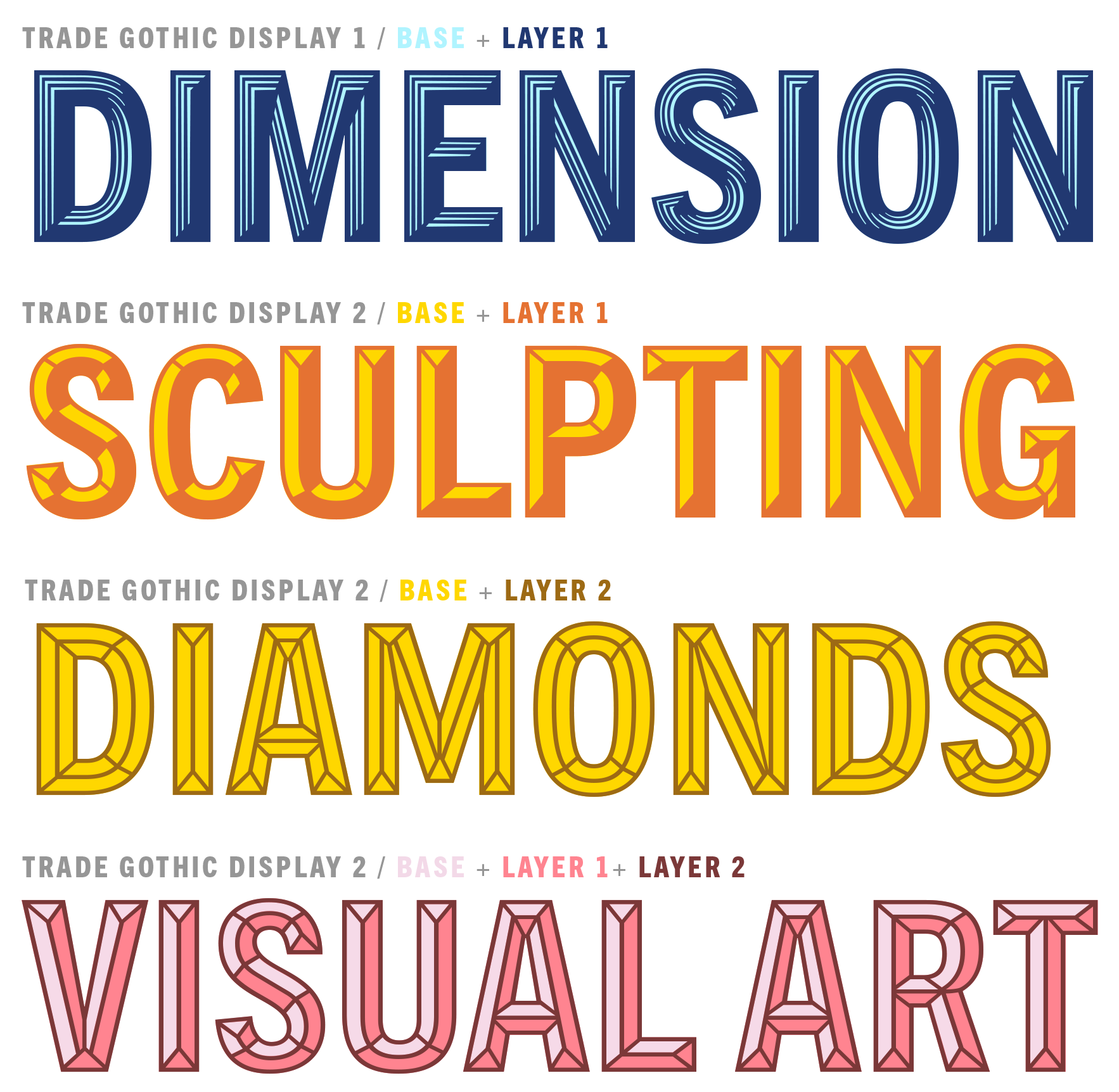
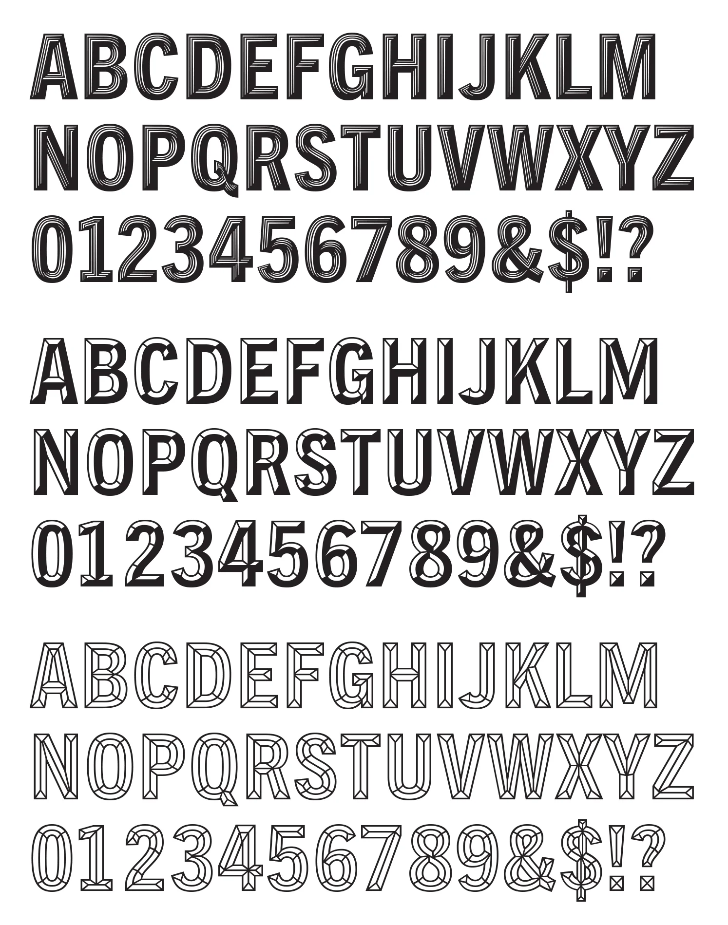
The first style was Trade Gothic Display 1, an embossed weight with highlights. The highlights are designed to swell and wane, maximizing the illusion of the raised surface.
The second style is Trade Gothic Display 2, which mimics a sharply incised bevel. This style has a shadow layer and an outline layer so users can pick their own combinations.
Both of the styles have a solid base layer, which all the decorative layers build on. The base layer was designed to be as faithful as possible to Trade Gothic Condensed Heavy, originally designed by Jackson Burke and later modernized by Akira Kobayashi. Some modifications, such as lowering the thick and thin contrast, were inevitable, but all weights are unmistakably Trade Gothic.
Client: Monotype
Type Director: Steve Matteson
Available for purchase through MyFonts